Saturday 19 September 2015

Working With PHP Include : First Baby Steps For Designers - Making A Low Maintenance Website

Experiment With “Include” PHP


Maintaining a large website such as Satzuma can become time consuming.  Using “include” can take the website to the next stage of modular design. Imagine having to write 1 line of code into a php file instead of having to copy & paste the same piece of code across 70 pages, worse still… imagine that piece of code had a typo – across all 70 pages! You start to get the idea – the horror. Using PHP include can reduce the time consuming method of copy and paste, shorten time, and take your website to that next stage of design (Or look at a CMS system). With this Include method, the information you amend in one file can change across multiple webpages, just to name a couple of ideas you can use this for navigation, footers, banner adverts and much more. I cannot emphasise how much easier this will make your life when working on larger projects. Change once to  update many!


How To Go About It


As a rough example we are going to make a footer module. We also have the main document that will  “include” pull in, integrate, import a file from your website.

This tutorial/experiment will assume you already have prior knowledge of setting your website up with root folders etc, if you need some more help with this please follow these tutorials.


https://helpx.adobe.com/dreamweaver/how-to/first-website-part1.html 

Or PHP


http://php.net/manual/en/tutorial.php


You Will Need: 

 - The main file (The parent/master)
 - An external footer file (why not add some styling to your html?) 
 
 - one line of code, which you will embed into the parent folder. 
 
 - A space to upload/test your experiment. (domain and hosting)


Stage 1 - Parent File

We will treat this file as the master file, the parent which pulls in the external modules to construct the page. Remembering that if you are using this modular method for constructing your website it will make life much more efficient.

Why not call your parent file ‘master.php’ 


This image shows (with straying CSS, bleurgh! ) the master.php and Product-footer-test.html working together... or popping out of the bottom. 
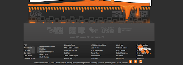
PHP include shwon in image

Stage 2 - Footer File


I have used the footer in the example, as this area of the website has frequent updates with new products and information constantly being change and added, and it is spread across the entire website… As you can see, all styling is added to this queasy example with the accursed table! Any changes or modifications will be included in the master file once you add the “include” piece of code to the master file. So what you change here (the footer file) will be visible once you come to uploading all of the files and testing the file. So... Design and build your footer file and add you styling to it.


Stage 3 - The Simple Piece of Code to Paste Into Your Master PHP file. 

The image below shows in red where the piece of "include" code sits. So, imagine you have made a hollow space on your webpage, in the hollow space you are going to add this code to the bottom. As shown. 


Product-footer-test.html"); ?>


This will call on the footer module and all of its elements.  Once you upload your files you can see whether the footer has worked.

This visual diagram will show how the principle will work leaving aside how the coding works for the PHP include.
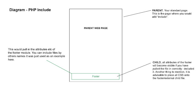
Parent, Child, Footer... How PHP include works for designers

Hope this helps, I plan to use this much more in the future.

Happy designing...

Sunday 28 June 2015

Business Card Sized Mini Prints. Artwork samples & illustrations. 1st Run

Mini Printed Pictures

I printed these mini business card sized pictures with idea to hand them out as sample prints to prospective businesses and to canvas for private commissions. Being pleased with the general quality of these miniature reproductions I am offering the last of the first run (1st Run) to the open market. Being satisfied with result of this batch I intend to print another batch although the characters and prints themselves may well be different in the next set.


A collection of miniprints to buy
Displaying the complete range of the first run

Top left to right : Bloated Zombie, The Poet, Golemn the cat, Madman's throne,
Gorian, Tulip, White hare, and the reverse of the card


About The Collection of Artwork

The collection of a printed cards consists of a range of illustration work taken from my portfolio, also available for viewing on JD illustration - my commercial illustration portfolio blog. Drawings and artwork vary from monsters, folklore to everyday characters. Some of the pieces have featured in exhibitions in the North and South East Cornwall.
The White Rabbit


The Poet

Gorian - The Miserable Imp

Can I buy These Cards?

Yes, although these cards are now in limited supply and once the first run from which there were 50 cards, there will be no more of these cards (1st Run) . Should you wish to purchase these cards I will sign the reverse before sending them to you via recorded post. The other 'Samples' do not have a signature which were sent out for canvasing purposes.

Please contact me for further information and which cards you would be interesting in buying from what is listed above.

http://jdillustration.jimmsdesign.co.uk/contact-freelance-illustrator.html


Monday 15 June 2015

Artwork Update - Fantasy & Folklore Art : Manticore, The White Hare and a Faun

Artwork Update : Fantasy & Folklore

I felt it was time again to add some of my fantasy and folklore artwork to Blogger as it has been a while. I have been busy on the illustration and design side of things so that can only be a good thing, but this does take me away from working on my own personal updates. So, I have selected a couple of pieces of artwork for your interest. 

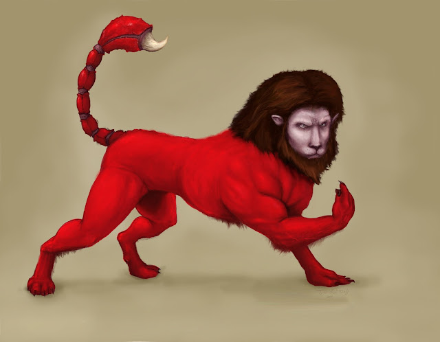
1 ) The Manticore : this is my rendition of the Manticore, a mythological beast with human features, the body of a lion and scorpion's tail. This depiction of the Manticore is based on a rewrite of a bestiary which was originally written by monks in the middle ages, which is a close as you could get to the original description of the mythological beast (how dare you! it's real I say!). Should you ever get the chance to read a classic historical bestiary I would recommend it - I don't know what those monks were taking but it seamed give them some fairly outrageous ideas! I also get the impression that most of these Monks didn't venture further than their chapel grounds, let alone visit the far east where they believed these creatures roamed free - so knights beware. I think one of my favourite inserts which I remember suggests : a virgin should cuddle a unicorn to cure a particular affliction... good luck finding a virgin!  


A digital painting of a red manticore
Red Manticore Illustration JD Odell

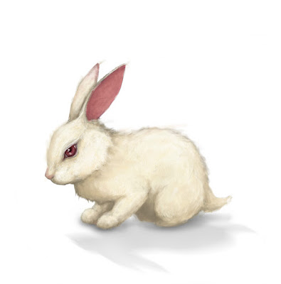
2 ) The White Rabbit (Hare) : I have written about this piece of artwork in previous posts and listings. This drawing was produced for a folklore exhibition I held in Looe in 2011 - with this animal being based on classic folklore "should you follow the rabbit your misfortunes will begin" the smugglers, sailors in Cornwall were superstitious in the day and this nasty legend was based on the misfortune of a young girl.

I wanted the Rabbit to look cuddly and enticing yet conceal an air of hidden malevolence to it, after all it is essentially a poltergeist. The artwork was produced using markers, pencils and PS.


The brief link below tells more of the 'White Hare' . Watch out when you next drink in the Jolly sailor in Looe - me and my partner are staying in a cottage on West Looe Hill

http://www.mysteriousbritain.co.uk/england/cornwall/white-hare-of-looe.html
The White Hare - Painting
White Rabbit - Don't follow it!

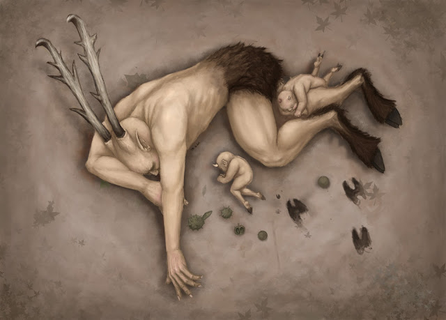
3 ) The Faun Sleeps : This was another piece of fantasy artwork! This image depicts a faun sleeping in the dirt with its younger siblings nestled around him. I was fairly happy with the drawing aside from the environment looking bleak and lack of colour depth in the image. In hind sight I also wished I added more texture to the picture to really pull you into the scene, the browns all merge into one as it stands which is fine although I wander what it would have looked like with more to it.

At the very least... does the image make you want to lie down on the soft ground?


A Sleeping Faun and babies
The Faun Sleeps - are you feeling sleepy?
I am more than happy to offer my services as a fantasy illustrator and artist be it for personal or commercial projects. For more information about my service please feel free to browse my website and contact me via my contact page. I can offer a range of skill with my main focus being in gritty details and commercial experience. My artwork has been used for print publications, marketing and graphic novels.

http://jdillustration.jimmsdesign.co.uk/


All artwork is Copyright James (Jimm, JD) Odell please do not reprint or distribute my artwork without prior consent. 2015


Folklore, monsters, creatures, fantasy, horror, drawing, artwork,

Thursday 7 May 2015

I Salute You 2015 - Highlights from the show

Salute 2015


A show dedicated to all things to do with war-miniatures, scenery and fantasy, I felt that I needed to pay a visit to this show. I have been to this exhibition twice to scope out any chances of networking with like-minded companies to pitch my freelance illustration and design portfolio to. The show had a great vibe - even from the off you could sense the eagerness of uber enthusasts just waiting to get into the hall and see what the show had to offer.

If you collect or paint models this show is a must and it was only £10 with an advanced ticket. Back in my day when I used to paint I would have cried with joy at coming to this show! Space marines and army men galore, I have attached some images from the show for 2015.

And hats off the the awesome painters (I could have never been that good) at the show and thanks to the SouthLondon Warlords.
http://www.salute.co.uk/


Dragon lizard model snapped from salute 2015

Painted giant snapped from Salute 2015 Miniature

Salute Soldier 2015
Salute game in progress 2015

If you like this at glimpse, then you should go next year!


Sunday 12 April 2015

Quick Techniques For Reducing Banding / Posterization in Photoshop - BRUSH STROKES


Posterization – Rough Techniques For Reducing Banding!


Notice the subtle rings around the soft brush?


What is it?

If like me you work as illustrator/designer, I’m sure you will have run into the dreaded banding aka Posterization If so, I will go into detail shortly. Please note; this is told from an illustration and design bias.

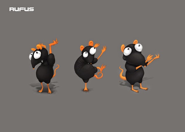
Illustration in Photoshop has been a blessing for me. Edit, undo, save as, copy, paste, re-colour artwork the list goes on. This issue comes when working with radial and linear gradients and tones of black and grey. Working with a lot of black and orange as part of the colour palette, I have had to figure out ways for dealing with or working around banding. For example, when I’m rendering characters like Rufus the rat, he has grey body with even darker creases in the body, getting the shading and highlights to blend hasn't always been easy - banding has been a big issue. As it stands, I’m still uncertain as to how to get a completely smooth finish when rendering by work with a grey and black tones. I can offer some methods for reducing this so called ‘banding’ effect and the bane of drawing Rufus. 

For additional information this has been written based on the specs of the my iMac - OSX, but this issue has proven to effective on a TFT Screen using windows 7 and older versions of PS.


My Setup 1 : New Document ‘I like RGB’

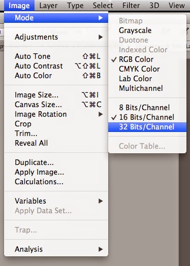
From the off I have tested this on Photoshop CS5 and CC with similar results from version to version. 64 bit – 32 bit RGB to CMYK I’m not entirely sure if this has an influence aside from whether you are working with 8 bit, 16 bit and 32 bit; the later offering marginally tighter rings and hues. For this example I have worked with A 300 DPI document, in RGB using 8 bit (this can be changed later) also with the colour profile listed below on an iMac. This is by no means a significant contribution to the final out come but maybe worth noting. 


‘tangent alert’
 Using RGB in the early stages is my preferred method, not everybody’s. Isn’t this madness? You won’t see genuine colours of your artwork! Well unless, your screen is calibrated exactly and your using pantones, guaranteeing what you see on the screen to print can be tricky anyway. Besides, I work across both mediums of screen and print. 

Method 2 :  Ultimate Trick - Brush & Noise

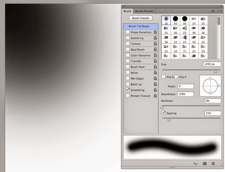
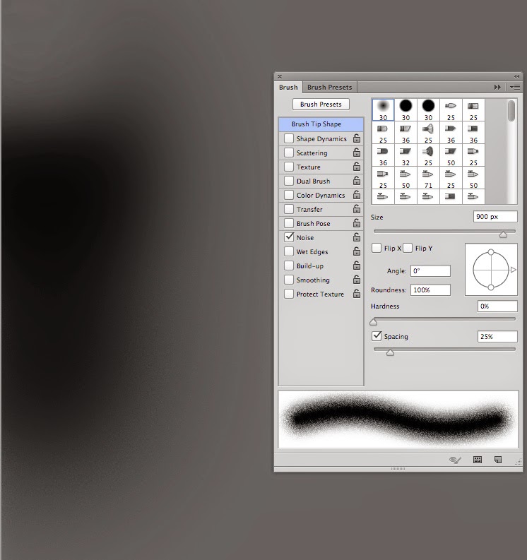
I’m assuming that you are running into this issue whilst using a soft edged brush tool in Photoshop, based on that, I would advise turning the 'noise' on under the brush panel (as shown - press F5 bring this window up) this helps in the blending of steps with greys as shown below. As far as I can tell, based on my work, this improved the overall smoothness and graduation of the tones from light to dark regardless of bit mode or any other. You can also dabble with the filters if you are using large radials (That would be a different article). 
As you can see below, the black brush at the top has rings (banding) and the one below has far fewer the brush used on the lowest part of the blob has noise switched on. The speckled effect will be less obvious once you take your artwork to print.

See how the rings blend together of the lower part of the blob?


Method 3 : Big to small, playing with scale


Another trick for tightening this banding is by shrinking/scaling down your completed artwork. When you have applied the 'noise' and finished the process you can physically shrink the image to hide some of the messier details - an illusion essentially. 


This is a method that I have used not only to disguise banding when digitally painting but also to give the appearance of tighter line work and detail.


Step 1 piece of art = 100%
Step 2 scale art to = 75%


So when you print the document some so the details and blemishes are hidden away from the naked eye. This approach can also hide some of the rings in banding with added element of noise!

Conclusion
You will see the benefits for this when you come to printing your work, especially if you are working with shades of grey.

To summarise - Add noise to your brush mode.

Hope this helps!

This method was used when illustrating/digitally painting Rufus the Rat for Satzuma LTD