Thinking In Black
Black
can be a trouble to work with when it comes to print, especially with
all of the varying print processes, paper finishes and general
variations with commercial printing machines, inks, screen
calibrations and so on - working with a black is a headache and I'm sure many others would agree! So, I have put together some tips and tricks to assist
with your projects - it can be a dark and treacherous path. This post will mostly focus on creative
approach rather than the pure technical aspects of Black ( K ).
Working with 4 colour printing and spot colours is a detailed
topic in its own right which is worthy of a post.
Illustrators,
painters, artists and photographers
Firstly,
does it really need to be BLACK? When I say does it need to
be ‘Black’ are there many things in the real world that are
completely black? Aside from an all light absorbing,
all-life-drinking black hole that absorbs all light and colour? Besides… that's something that;s not of our world as far as I'm aware. Looking at the world around you, you will see come to see
how lighting, surface, atmosphere and texture will absorb surrounding colours, including
what you would what you would call a black surface. For example, someone is wearing a black
t-shirt, more often that not if, even if it is new, light will catch
on the folds, the creases and the contours of the fabric giving the black fabric a
slight hue or tint depending on the light source and ambience.
Study things! I like to look at surfaces and objects that have an interesting finish for example : gloss surfaces, bottles, matte paint, skin, fur, hair, shadows, animals, sunglasses, cloth, etc. Another good source of reference of how to use light and dark with dramatic effect is Chiaroscuro – do some research online - research Caravaggio (one of many artist's using this approach) and see what comes back. Caravaggio used light and dark with excellent dramatic effect framing the narrative in light and shadows. This is potentially subjective but hopefully... it will be food for thought – if its jet-black you’re after then please read on! ( I have attached a little image below with some dark but not black shading )
Study things! I like to look at surfaces and objects that have an interesting finish for example : gloss surfaces, bottles, matte paint, skin, fur, hair, shadows, animals, sunglasses, cloth, etc. Another good source of reference of how to use light and dark with dramatic effect is Chiaroscuro – do some research online - research Caravaggio (one of many artist's using this approach) and see what comes back. Caravaggio used light and dark with excellent dramatic effect framing the narrative in light and shadows. This is potentially subjective but hopefully... it will be food for thought – if its jet-black you’re after then please read on! ( I have attached a little image below with some dark but not black shading )
 |
| Illustration with a pinch of mood lighting! Left : a world of pure black and white without colours, the others... and bit of hue and tint |
RGB
controversial
Typically,
I like to work in RGB first and then convert my files to CMYK
afterwards, especially if I’m working on a bitmap illustration or
digital painting. Why? Because working in RGB generally gives me more
creative freedom in the beginning and it also allows me to move between digital and
print at a later date anyway. This is a my preferred method when working on an illustration and by no means a rule, just a preference. I’m not the only one working this way. By doing a Google
search I stumbled upon a commercial artist who also likes to work
this way – this writer and artist goes into much greater detail
about the in’s and outs of color channels on their blog. I
recommend having a read at some stage – perhaps after you have read
my post. :-)
Unexpected
Results - a pleasant accident
I
was always taught to work in CMYK for print and RGB for digital. I still
champion this for working with professional printers as trying to
print from RGB file may produce some erratic results, be it for leaflets printing,
flyers, and other mediums. I accidentally ran a test print from
Photoshop in RGB (Thinking it was CMYK) and the results were far more superior than the CMYK
version. Both were printed on the same satin finish paper, on a Canon
Pixma A3 with an impressive result. Despite my efforts and tinkering with the levels in the CMYK version to replicate what had happened In the RGB Version, I couldn’t produce the same results. I will make an
assumption that my Inject printer translated the RGB to CMYK and just
knew what I was after. I can’t complain too much as this project was sent to print and retained all the vivid colours and strong black colours. Saying this, I
still recommend trying to stick with the CMYK for design and print
despite this result as this is typically what is asked - best to be safe, but something worth exploring for the future.
Digital - Add a Hue
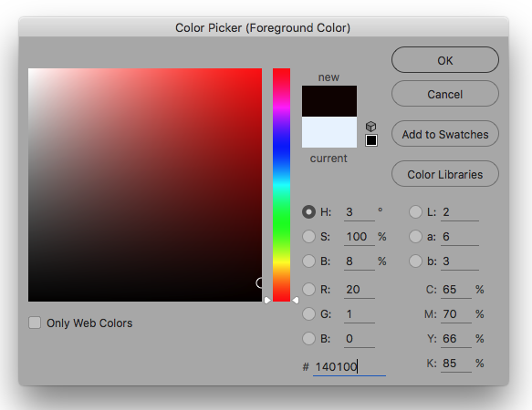 |
| Have a little play in the Colour Palette - this is the picker from Photoshop |
Tips + Photoshop!
If
you are working on a image in Photoshop and have started in RGB and
want to convert your artwork colour settings in Photoshop, don’t just click on
“convert to CMYK” use the colour profile under edit instead as
this will provide better results. Use U.S.
Web Coated (SWOP) v2. Experiment with the different settings to get
the desired finish.
Last Key Points!
- Take heed of the colour warnings when you
are in the colour picker window. This could save a lot of headache
later on.
- Let the printer do the leg work. Send your artwork to the printer and try to let them help you. A printer worth their salt will want to help you and have your return custom. To reinforce what results you could also send them a physical sample (saying like this please!) from your home printer – assuming you have a good quality home printer.
- As mentioned previously, if you are working on an image with a lot of dark areas why not add a little hue / tint of colour? 20% cyan for example or some magenta/red for a warmer image.
- Avoid working with 0, 0, 0, 100 K, as this best reserved for font/text printing and can your work charcoal appearance. Use a ‘Rich black’ or 'designers black' instead. 20, 20, 20, 100 k for example.
- Avoid 100, 100, 100, 100, CMYK as this is reserved for crop marks and using this colour can drown the paper - no one wants drowned paper!
- Don’t be fooled. Your screen can be way out of the
sync with your printer. Do some test’s first and see what results
come from your printer (even printing on your home printer cannot
guarantee the finish you require when you send your work to print) So
take note.
Yes... black can be painful to work with! And can be tricky colour to tame!