Saturday 24 December 2016

Speed tips for photoshop layers!

Ho Ho Ho a quick post before Xmas!

A couple of tips for working with Photoshop layers!


If like me you need work layers in Photoshop any time saving measure is a bonus. I have a compiled a short list of techniques for making the best use of Photoshop’s layers and icons and this is by far… only the tip the iceberg for tricks and techniques. Enjoy! (Swap CMD for CTRL on Windows)

Change the layer order, move it up and down :
Cmd+[ Move Down
Cmd+] Move Up 

Cmd+Shift+] = to move it to the bottom of the stack
Cmd+Shift+[ = Move it to the top of the stack
Direct select a layer
With move tool selected (V) hold
Cmd to highlight the layers directly from the art board. This will also highlight groups.

Duplicate a layer 
Ideal for copying a layer! Cmd + J to copy a selected layer! Or you can drag the selected on this icon! OR right click and duplicate. A personal fave.
Colour Coordinated
In addition to organizing you layers into folder and groups, why not colour coordinate the layers so you glance at groups? Brown for dirt, green for sea etc. Right click and select a colour.

New Layer Cmd+Shift + N brings up the new layer dialogue.

Cycle Through Blend ModesNeed to see what a multiply, saturation, or overlay will look like on the fly?

Shift + (Minus or plus, top right of the keyboard)
Layer Opacity
With the layer selected you can quickly change its opacity by pressing ...
Shift + 22, 30, 23 (a number from the top row) typing the number in quick succession will change the layers opacity percentage. Hold shift and then press “22” the layer will be 22% “30” = 30 %. Very handy for digital painting or retouching.
Group Layers
Select your layers and press
Cmd + G to group them together. If you are not grouping your numerous layers… you should start. For sanity’s sake.

Well everyone! I hope this is a little something to leave 2016 on! Merry Christmas and a prosperous new year!

#Photoshop #tips #layershortcuts


Wednesday 14 December 2016

Freelancer Tips 2 - Designer, Illustrators, Developers - Morale, money and clients


Well, I felt that as the other post about freelancer tips had some interest that I would write another post with some pointers that would make life just a bit more bearable when delving into the life as a freelance designer! I'm also sure that some of these pointers are transferable across other creative professions, so here we go.

** Manage Client Expectations **

That's almost all that needs to be said. Make sure that you and the client are on the same page in terms of what they expect at the end of the project. Be up front, discuss budgets and see that you are both heading towards same goal. Failing to manage their expectations in the initial stages can result in dissatisfaction and loss of a client. Avoid surprising them, be up front, see what they want, check that you can deliver on what that want and you may save yourself and them a whole load of hassle!

Clients to Avoid

In the early stages you will probably bump into many clients who may be trouble than their worth to your business. This isn't a personal criticism of these clients, nor are they strictly conscious of their actions but you need to build a viable business take some of these behaviours into account. A bit of fun below, Client types:

- The non-payer: yeah we have your number Non-payer and shame on you. I bet if the shoe were on the other foot you'd be among the first to complain about not being paid! The trouble is some of these people that have an adversity to honourable business practices is, they can be tricky to spot. They may vanish without a trace when it comes to payment (pppppoooohhhhfff – the sound of them vanishing from the phone, emails, post code). What do you do? It's best to ask for a deposit at the start of a project to see if they are fare dodgers, if they wince at the thought of paying you a starter fee (even a small one) be very very careful! You could find yourself out of pocket.

- The Cheapskate: And you! Stopping asking students to produce work for nothing whilst in the process of cheapening the design industry! Stop! I don't care. In all honestly you can spot these clients quite early, and in fairness they are just trying to use a bit of business sense. But remember fellow designers… you are a businessperson too and you need to make a living before making a profit. Stand strong and admit that you need to make money, eat, pay rent/mortgage keep a family and that the client hiring you are doing so for you skills and expertise. Have respect for your skills, if you don't they certainly wont. And don't do spec work for free, sometimes this is rewarding but more often that not this is company or client looking to explore insecurity and gain something for nothing. Again… they probably wouldn't offer their services for free – unless they are charity, then that is a whole different kettle of fish. One small exception to this rule is when you are student – getting real commercial work is like gold dust in the early days. Even then, when I was a student doing a HND in design we a great lecturer that would find us clients and live worth that work give all the students a bit of money, not a lot but a bit.

- The Disrespectful One: trust me , these guys can put real sour taste in your mouth avoid them if possible. Sometimes the general lack of respect (sometimes combined with ignorance) can take a little while to manifest and no matter how much you try to win someone round, educate, inspire they just see your skills as an superfluous aspect to their business, “you just make things look pretty”you are skills are never an investment, to them they wander if they can do a better job, whether their cats or dogs can do your job and they don't even have thumbs “ah anyone can do that” or quote - “The computer did that!”. This type of client alone can be the underpinning for statements above. Be warned and be ready. To tell the truth, this can be tricky to draw out its ugly head. Engage in conversation, and maybe ask some questions about the business. What do they need from a designer, is there anything else they like on the market etc. You are contending with an attitude towards you professional skills and in the films you can almost always win these people round... these is probably not the case in the real world. You will just start to get a gut feeling from this sort of client from odd little quips and remarks, this can also be especially prevalent if you work in-house. – Show yourself a little self-respect even if the client won't move on! Onward and upward... if you can afford to.

Selling Yourself Short
Or the design industry in general. “I'm new so I won't charge anymore that bag of peanuts and a pat on the back!”Why? Have confidence! If you have trained as a Graphic designer, artist, or any other profession be creative or technical, have faith in you skills. If you don't have faith in your skills how do you expect your client to faith in you? Not only that, if you go in for a low ball number it just says to the client that they may be dealing with someone who lacks confidence knowledge, and also you draw out the wolves – and you will be the wounded animal – and like wolves, they will smell vulnerability. You will probably want to avoid working hard and getting very little pay in return, it gets old trust me on that. You also cheapen the industry, stop.

Don't be Desperate
This one is also tricky to avoid as a graduate or newbie. Companies and recruiters will know that you will be probably be desperate for a job as you will have 0 years experience. If you really want a job, desperation can lead you to making bad decisions early on with selecting employers and clients that will want to take advantage of you. If a position or a job smells fishy, don’t ignore that gut feeling. If someone is taking advantage of you be prepared to say 'no' and walk away. That willingness to say no will save you hassle, be prepared to walk away if it feels like the right thing to do... and make sure you complete what was required if things got that far.
Well I hope that gives you something to consider. Its not all terror out there in wilds of design but there are pitfalls you should avoid. I have run into these on a couple of occasions but they are much less frequent these days. If you are new I would advise taking some of the above on board. If you a season professional you can look back and laugh (or cry) at some of the points above. Have a good one all!

“I ain’t paying £5 for a business card!” – this was said in response to offering them a branding make over!

Feel free to post any mini stories or rude comments.


Monday 5 December 2016

Living Dead Art Post - Zombies & Ghosts


Feeling that is was other due for another artwork post featuring my artwork. For this post I have grabbed a couple of pieces of work of my illustrated undead. Sketching, painting and rending all of the grisly details these wanders is always a pleasure for me as I can really go to town on the details and drive home a certain level of earthy realism, whether that be open muscle tissue, spots, bones, organs or bodily fluids. Read on!

The Undead, hungry and the lost for all eternity, they roam the earth until the end of days seeking retribution and flesh. 

Hollow Zombie

This is a slightly older image capturing a partially decomposed zombie ambling around in it’s tattered clothes, torn flesh and its stomach bloated with decay. The image captures 2 states of the zombie, with its stomach and without. This image was painted in drawn by hand and then rendered in Photoshop.

Ghoul – Swamp Zombie


And so, our undying friend has awoken from his long slumber by the dawn chorus of walking corpses... or a grave digger.
This illustration captures the moment the Ghoul clambers out from a peat bog to meet his brothers in death. Although undead or partially living, I wanted to capture a hulking mass of muscle that that could serve any necromancer, witch or warlord as long as it is paid in meat. The creature is also closer to life that death and so wanted to capture and expression of “Where am I!? - I was alive a moment ago”


Lady of the Lane
As with many folktales and local legends, I wanted to illustrate my rendition of the Lady of the Lane for exhibition I held in Looe in Cornwall. The Lady of the lane or the White lady is said to haunt a narrow lane leading to Talland Bay.

Holiday makers and revelers be wary when walking back to the camp site, should you see a white figure coming towards in the dead of night turn on your heel and run for the pub… ghost’s have little taste for beer.


https://www.patreon.com/jdodell
Thank you for reading this post! If you would like to support me on Patreon please feel free to sign up. On a Ad hoc basis I submit artwork for you to enjoy. Or you can follow me on twitter!

I can also produce print on an Print on Demand basis which can take up to a Month to Print produce and ship.


Sunday 27 November 2016

Underwater : filming underwater Looe's (Cornwall) second beach - GoPro Session waterproof


Underwater

I wanted to test the capabilities of the GoPro Session in shallow waters  of Looe’s Second beach, I thought it to be as good place as any to test a GoPro. The video captures the the incoming tide from beneath the surface of the water. In this clips you will see; seaweed, rocks, sunlight / sunbeams, murky water, clear water and swimming hand cam, for which I apologise.

1 ) Going under water / fear of damaging my new equipment : a quick clip to test the GoPro going underwater
2 ) Rising Tide : this is the same location with the GoPro being jammed between some rocks. Its almost therapeutic
3 ) Deeper Water : The tide is rising quickly, offering a small clearing among the rock pools in which I can swim/snorkel with a certain degree of freedom
Sun rays beaming onto the rocks through the waters surface
rising tide and seaweed on Looe beach from underwater perspective
Bubbles with a finger tip/ swimming against the tide
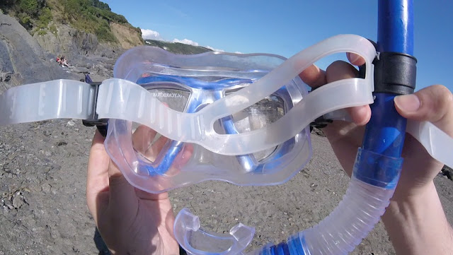
About to wear a snorkel! before going into the water
Silt and seaweed! would you put your hand in it?


Or watch it full quiet HD > https://youtu.be/w51dFVQP-YA

Growing up by the sea and having a keen interest in the coast, one of the first things I would want to record with a waterproof GoPro is activity in the water. The GoPro Session claims to be a water resistant HD camera and I can now, personally vouch for this product, it is indeed waterproof! The Session lives up to the reputation as is claimed and I have been happy to share a this tester video. Feel free to comment and name any of the creatures, seaweed that are in this video.

This video was filmed in August 2016 around the bank holiday. This is Looe, Cornwall’s second beach among the rock pools. I think they are winkles at the end but not entirely sure. Feel free to share.

Wednesday 19 October 2016

Thinking In Black – Tips and hacks for working black in digital illustration


Thinking In Black

Black can be a trouble to work with when it comes to print, especially with all of the varying print processes, paper finishes and general variations with commercial printing machines, inks, screen calibrations and so on - working with a black is a headache and I'm sure many others would agree! So, I have put together some tips and tricks to assist with your projects - it can be a dark and treacherous path. This post will mostly focus on creative approach rather than the pure technical aspects of Black ( K ). Working with 4 colour printing and spot colours is a detailed topic in its own right which is worthy of a post.

Illustrators, painters, artists and photographers

Firstly, does it really need to be BLACK? When I say does it need to be ‘Black’ are there many things in the real world that are completely black? Aside from an all light absorbing, all-life-drinking black hole that absorbs all light and colour? Besides… that's something that;s not of our world as far as I'm aware. Looking at the world around you, you will see come to see how lighting, surface, atmosphere and texture will absorb surrounding colours, including what you would what you would call a black surface. For example, someone is wearing a black t-shirt, more often that not if, even if it is new, light will catch on the folds, the creases and the contours of the fabric giving the black fabric a slight hue or tint depending on the light source and ambience.
  Study things! I like to look at surfaces and objects that have an interesting finish for example : gloss surfaces, bottles, matte paint, skin, fur, hair, shadows, animals, sunglasses, cloth, etc. Another good source of reference of how to use light and dark with dramatic effect is
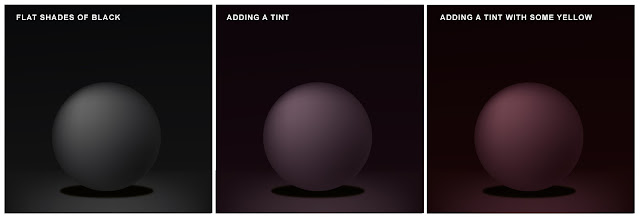
Chiaroscuro – do some research online - research Caravaggio (one of many artist's using this approach) and see what comes back. Caravaggio used light and dark with excellent dramatic effect framing the narrative in light and shadows. This is potentially subjective but hopefully... it will be food for thought – if its jet-black you’re after then please read on! ( I have attached a little image below with some dark but not black shading )


Illustration with a pinch of mood lighting! Left : a world of pure black and white without colours, the others... and bit of hue and tint

RGB controversial

Typically, I like to work in RGB first and then convert my files to CMYK afterwards, especially if I’m working on a bitmap illustration or digital painting. Why? Because working in RGB generally gives me more creative freedom in the beginning and it also allows me to move between digital and print at a later date anyway. This is a my preferred method when working on an illustration and by no means a rule, just a preference. I’m not the only one working this way. By doing a Google search I stumbled upon a commercial artist who also likes to work this way – this writer and artist goes into much greater detail about the in’s and outs of color channels on their blog. I recommend having a read at some stage – perhaps after you have read my post. :-)


Unexpected Results - a pleasant accident

I was always taught to work in CMYK for print and RGB for digital. I still champion this for working with professional printers as trying to print from RGB file may produce some erratic results, be it for leaflets printing, flyers, and other mediums. I accidentally ran a test print from Photoshop in RGB (Thinking it was CMYK) and the results were far more superior than the CMYK version. Both were printed on the same satin finish paper, on a Canon Pixma A3 with an impressive result. Despite my efforts and tinkering with the levels in the CMYK version to replicate what had happened In the RGB Version, I couldn’t produce the same results. I will make an assumption that my Inject printer translated the RGB to CMYK and just knew what I was after. I can’t complain too much as this project was sent to print and retained all the vivid colours and strong black colours Saying this, I still recommend trying to stick with the CMYK for design and print despite this result as this is typically what is asked - best to be safe, but something worth exploring for the future.

Digital - Add a Hue


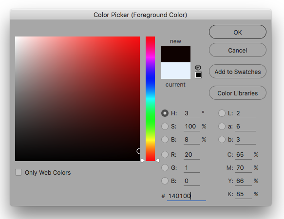
Unless your are working in RGB and your artwork will remain for screen (digital) only. Then may be best to work withDesigner Blackcheck the numbers. Although the computer says it black (or you've had it calibrated) it is best to drop a bit of colour into the mix - and do test print it.


Have a little play in the Colour Palette - this is the picker from Photoshop


Tips + Photoshop!

If you are working on a image in Photoshop and have started in RGB and want to convert your artwork colour settings in Photoshop, don’t just click on “convert to CMYK” use the colour profile under edit instead as this will provide better results. Use U.S. Web Coated (SWOP) v2. Experiment with the different settings to get the desired finish.

Last Key Points!

  • Take heed of the colour warnings when you are in the colour picker window. This could save a lot of headache later on.

  • Let the printer do the leg work. Send your artwork to the printer and try to let them help you. A printer worth their salt will want to help you and have your return custom. To reinforce what results you could also send them a physical sample (saying like this please!) from your home printer – assuming you have a good quality home printer.
  • As mentioned previously, if you are working on an image with a lot of dark areas why not add a little hue / tint of colour? 20% cyan for example or some magenta/red for a warmer image.
  • Avoid working with 0, 0, 0, 100 K, as this best reserved for font/text printing and can your work charcoal appearance. Use a ‘Rich black’ or 'designers black' instead. 20, 20, 20, 100 k for example.
  • Avoid 100, 100, 100, 100, CMYK as this is reserved for crop marks and using this colour can drown the paper - no one wants drowned paper!
  • Don’t be fooled. Your screen can be way out of the sync with your printer. Do some test’s first and see what results come from your printer (even printing on your home printer cannot guarantee the finish you require when you send your work to print) So take note.

    Yes... black can be painful to work with! And can be tricky colour to tame!

Thank you for reading!


Monday 10 October 2016

Consider The Brief : some short tips on writing a design brief

Contact paper black and white icon

Consider The Brief

Designer to Client!

This post has been written up to offer information with regards to setting up rough guidelines for setting a brief. Imagine answering the following...

Purpose & Plan

What is the purpose of the project? Is it to expand the business, launch new products or promote something that you are already offering to an exiting customer? In other words, you will need to have some sort of a plan and end goal in mind for the project. If you don't know what it is that you business needs it will be trickier for a designer help. With out a plan, even a loose one, you will end up going around in circles. Maybe ask yourself some of these questions :-

  • What do I want to get out of it? 
  • What will my return on investment be? 
  • Can this be achieved? 
  • Should I do this now? 
  • What is the competition doing? 
  • How can do it differently/better?
Those are a couple of suggestions.

Budget

Budget is important to consider as this will affect the amount of time that will need to be allocated to your project - factoring in deployment, build/design, concept and whether anything else needs to be considered.
If you have a larger budget for your project(s) then you may want to consider a cascading approach. This method, is far more open ended financially but allows for plenty of creative and innovative freedom, a designers dream. A draw back with this free flowing approach is that money and keep on going into a project, regular checks on the amount spent so far are a good approach and ball park figure should be offered in the beginning, especially with smaller business with tighter purse strings. The other method is a fixed price, this method for spending usually suits both parties, or so I have found, a draw back with this is that sometime contracts and prices need to sometimes be re-evaluated should there be substantial changes to a project specification. Favourite approach – Fixed prices discussed in the beginning. Factoring changes (or tweaks) requests will increase price as more time will be required.

Time Frame

Please take into account when you need a project to be completed, things can take time to finish in addition with other projects. Also, waiting to hand over all relevant information at the last minute will end in disappointment eg, sending all the photo's over for flyer an hour before a production deadline or as the designer needs to leave will not make the best of it... Get the relevant information such as, text, photo’s, FTP details etc over in decent time. The earlier, the better! Trust me on this one.

Target Market

If this is a design project that is yet to have a brand established have you considered who the target market will be? Is this for children, adults, professionals, tourist, artists, trade and so on.

Branding

Do you have an existing brand guidelines for your company? If you have any existing logo, colours, fonts, do’s and don’ts this may be required for the project to be completed.


Deployment

Depending on the desired project, how do you intend to deploy the project? Will this be a small web banner, a flyer, will you be using a printer, will this be a for screen, will it be for print? It is worth considering how this may evolve in the future be it for print or screen. It is easier to scale a large file down or resize a vector than it is to resize a 60 px 60 px logo onto a bricks and mortar shop.

Limitations

Is there anything in the that a designer can't do? Will it be for a certain target demographic, politically sensitive, have to fit on some something small, needs fit x y z etc etc


So, you have written a brief....

Dear Designer,
I want you to create something that brings value to the company, here includes the specification and the brief to expand my business! Thank you for offering your time and experience!

Hope this helps a bit!

Should you require any design services feel free to have a look >

Creative Design Services >

Monday 8 August 2016

Satzuma : Design & Development Projects Update Summer 2016

ORANGE WITH A SPLASH OF BLACK

its black and orange!” That was the first thing I noticed when I received my current employer shortlisted me and sent me a link to their web address! What's not to love about black and orange – as a kid orange used be my favourite colour and now I practically dream in it. I felt that it has been long overdue that I should post a blog update with regards to some of the creative projects that I have had the honour of working on in the past couple of years. These range from designing Air applications, websites, characters, product videos, intro's flash animations (now Animate CC) and many more.

Bit of Action Script 3

THIS WAS AN AIR APP AND BROWSER DEMO
FOR DIY PHONE CASE PRODUCT

Stand design at the Harrogate Show - TETO!


My Rufus illustrations for the book cover artwork!
Website Interface
Packaging for the Smartphone Joystick

Above, I have added the interface design and the screen grabs of the working iDesign application, this was built in flash and written in AS3. The other projects cover the trade show picks, illustration, UI and some packaging.

Not Just Design And Development.

Satzuma is a company that cultivates a think different approach, be it in marketing and design or its approach to business. Having the opportunity to work with like minded team and being at the forefront of the creative process has given some invaluable experience in creative direction, hiring staff, working with freelancers, collaborating with business development and of course, recruiting fellow design interns!

"Satzuma illustrates three important skills; Do one thing well, make it a fun thing and think different"
- Guy Kawasaki, Former Marketing Chief of Apple


"I have worked with Jimm for over 6 years across hundreds of commercial projects. Jimm's ability to produce my ideas or concepts quickly by carefully listening and understanding to what I need or want commercially makes the difference. His design skills by hand and computer combined has always produced highly creative and unique pieces of work which has formed one of the main corner stones of our business."
J Ramm, Satzuma LTD

Thanks! :-)

Wednesday 27 July 2016

Simple Custom Cursor For Your Stencyl Game


The following block shows a simple method for making your own custom cursor.  Please refer to the Stencyl community help section for further details on coding blocks.


General Gist : this little 'how to' covers some basics for making a custom cursor in Stencyl. In a nutshell, you need to hide the default operating system cursor and swap out for your own custom cursor, which will be an actor type.


Part 1 : Graphics

1 ) Firstly you will need to draw your one custom cursor in graphics program of your choice. I used Adobe Illustrator to draft up this pointer and exported it as a .PNG – Dims 29px 27 px, remember to save your .PNG in logical place in your project folder.
Part 2 : Importing a Cursor As An Actor Type

1 )Open Stencyl and navigate to your game project (assuming you have already made a project)


2 )In the upper left corner press on the “Actor types”and create a new actor. You will then need to add a frame and import your newly created cursor!

Part 3 : How To Make it work

1 ) Click on 'actor behaviours' and create a new behaviour! This will be a basic behaviour to make your Cursor work in your game.
2 ) Click “add event” in the top of the panel. Add > When updating


3 )You can either navigate through the code blocks manually or you can search for them. Using the image shown. Thats how to make a basic Cursor in Stencyl! Don't forget to attach the block to the Cursor Actor, the green button in the top right will allow you to do this - “Attach to actor”

Block for making custom cursor


Run game!

Bug with cursor full screen * untick fullscreen mode!

Please take into account that the flash player from Stencyl ( when tested from the game ) game glitches in full screen mode. The main default operating system mouse will still be visible despite having the cursor hidden.This could be an apparent issue with the flash player. - Dated from May 2016. Try unticking the full screen mode... Not the best

Notes : this bug happens on a iMac OSX i5 10.9.5